In the realm of digital design, dark mode has emerged as a trend that’s here to stay. It’s more than just a stylish choice.
Dark mode design offers a host of benefits, from reduced eye strain to battery conservation. It’s a feature that users have come to expect.
But how do you effectively implement dark mode in your digital products? How do you balance aesthetics with functionality?
This comprehensive guide will delve into the world of dark-mode design. We’ll explore its benefits, best practices, and how it’s used across different platforms.
Whether you’re a web designer, app developer, or just interested in the impact of dark mode, this guide is for you.
Let’s embrace the night and dive into the fascinating world of dark-mode design.
Understanding Dark Mode Design
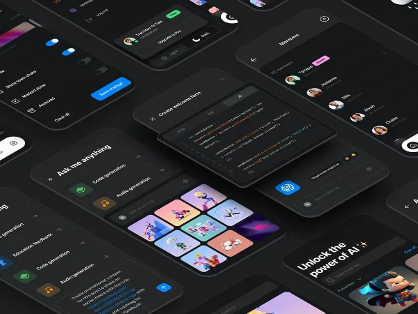
Dark mode design, also known as night mode, is a user interface (UI) design choice that uses a dark color palette. It primarily uses shades of black and grey for backgrounds, with lighter colors for text and icons.
This night mode design trend has gained popularity in recent years. It’s now a common feature in many operating systems, apps, and websites. The rise of dark mode design is not just about aesthetics, but also about improving user experience and accessibility.
The Benefits of Dark Mode Web Design
Dark mode design offers several benefits that enhance user experience. These benefits range from physical comfort to device performance.
One of the main advantages is its appeal to users who prefer a darker aesthetic. It provides a visually striking alternative to the traditional light-themed interfaces.
However, the benefits of dark mode design go beyond aesthetics. It also has practical advantages that can improve the user’s interaction with the device.
Here are some key benefits of dark mode design:
- Reduced eye strain
- Battery life conservation
- Enhanced accessibility and inclusivity
Reduced Eye Strain
Dark mode design can help reduce eye strain, especially in low-light conditions. The lower brightness of a dark theme can be less fatiguing on the eyes, making it a comfortable choice for night-time use.
This is particularly beneficial for users who spend long hours on their devices. It can help minimize the risk of computer vision syndrome, which includes symptoms like eye discomfort, dryness, and blurred vision.
Battery Life Conservation
Another advantage of dark mode design is its potential to save battery life. This is especially true for OLED and AMOLED screens, where black pixels are essentially turned off.
By using a dark theme, these screens can significantly reduce power consumption. This can help extend the battery life of mobile devices, making dark mode a practical choice for users on the go.
Accessibility and Inclusivity
Dark mode design also plays a role in accessibility and inclusivity. It can be a helpful feature for users with certain visual impairments, such as photophobia, a condition that causes light sensitivity.
By offering a dark theme option, digital products can cater to a wider range of user needs and preferences. This inclusivity can enhance user satisfaction and engagement, making dark mode a valuable addition to any design toolkit.
Implementing Dark Mode: Best Practices
Implementing dark mode design requires careful consideration. It’s not just about inverting colors. The goal is to maintain readability and visual hierarchy while providing a comfortable user experience.
Here are some best practices to consider when implementing dark mode design:
- Pay attention to contrast and color schemes
- Ensure legibility and readability
- Test your design across different devices and platforms

Contrast and Color Schemes
In dark mode design, contrast is crucial. It helps maintain a visual hierarchy and guides the user’s attention. But too much contrast can cause eye strain, defeating the purpose of dark mode.
Color schemes also play a significant role. Dark mode is not just black and white. Using shades of gray can soften the contrast and make the interface more visually appealing. Accent colors can also be used to highlight important elements.
Remember, the goal is to create a balanced and harmonious interface that is easy on the eyes.
Legibility and Readability
Legibility and readability are key in dark mode design. The text should be easy to read against the dark background. This often means using lighter text colors, but not pure white as it can be too harsh.
Typography also plays a role. Some fonts may not be as legible in dark mode. Testing different font styles and weights can help find the best fit.
Lastly, consider the size and spacing of your text. Larger text and ample spacing can improve readability in dark mode.
Dark Mode in Different Platforms
Dark mode web design is not limited to a specific platform. It’s a universal design trend that can be applied across various digital products. From operating systems to applications, web to mobile design, dark mode has found its place.
Operating Systems and Applications
Operating systems like macOS, Windows, and Android offer dark mode settings. This affects the appearance of the system interface and apps that support dark mode. For instance, popular apps like Slack, Twitter, and Google Chrome have embraced dark mode.
Web and Mobile Design
In web and mobile design, dark mode is becoming increasingly popular. Websites and mobile apps offer dark mode options for users. This not only enhances user experience but also aligns with system-wide dark mode settings. It’s about offering a consistent and comfortable viewing experience across all platforms.
User Preferences and Dark Mode Settings
User preferences play a crucial role in dark mode design. It’s about giving users the freedom to choose their preferred viewing mode. This can significantly enhance user experience and satisfaction.
Offering Dark Mode as an Optional Feature
Offering dark mode as an optional feature is a common practice. Users can switch to dark mode if they find it more comfortable. This option is usually found in the settings menu of the app or website.
Toggling Between Light and Dark Modes
Toggling between light and dark modes should be easy and intuitive. A simple switch or button can be used for this purpose. This allows users to change modes based on their preferences or ambient lighting conditions.
Challenges and Considerations in Dark Mode Design

Designing for dark mode is not without its challenges. It requires careful consideration of various factors. These include maintaining brand identity, ensuring readability, and addressing potential drawbacks.
Maintaining Brand Identity
Maintaining brand identity in dark mode can be tricky. Colors may appear differently against a dark background. It’s crucial to test your brand colors in both light and dark modes to ensure consistency.
Potential Drawbacks and Solutions
One potential drawback of dark mode is reduced readability in bright environments. To address this, you can offer a light mode option. This allows users to switch modes based on their current lighting conditions.
How to design dark UI?
Designing a dark UI (user interface) can be both aesthetically pleasing and functional. Here are some key principles to follow:
Color Palette:
Move Beyond Black: Pure black can cause eye strain. Opt for dark grays (around #121212) as your base color. This provides contrast for text and UI elements while remaining dark.
Accessibility is Key: Ensure sufficient contrast between text and background colors. Use online contrast checkers to verify you meet WCAG (Web Content Accessibility Guidelines) standards (minimum contrast ratio of 4.5:1 for normal text).
Limited Color Palette: Stick to a limited color palette for a cohesive look. Consider a primary brand color at low opacity for subtle branding within the dark theme. Avoid overly saturated colors, which can cause visual strain.
Text and Icons:
Prioritize Readability: Use light-colored text (white or light gray) for optimal readability against the dark background. Choose clear and easy-to-read fonts.
Icon Adjustments: Icons designed for light themes might need adjustments for dark UIs. Invert colors, increase line weight, or recreate icons to ensure proper visibility.
Focus on Hierarchy and Depth:
Leverage Negative Space: Effectively use negative space to create a sense of balance and avoid overwhelming users.
Subtle Depth Cues: Since shadows don’t work as well in dark UIs, use alternative methods to indicate depth and hierarchy. Employ subtle variations in color value, opacity, or slight layering effects to create a sense of dimension.
Additional Considerations:
Consider Images and Visuals: Ensure images and other visuals are adjusted for the dark theme. They might require increased brightness or contrast adjustments for proper viewing.
User Preferences: Provide a toggle switch or option for users to switch between light and dark themes, catering to individual preferences.
Test Thoroughly: Test your dark UI design across different devices and screen resolutions to ensure optimal viewing experience.
Here are some additional tips:
Research and Inspiration: Look at existing dark UI examples for inspiration. Popular websites and apps often showcase effective dark theme implementations.
Usability Testing: Conduct usability testing with real users to identify any readability or usability issues with your dark UI design.
Iterate and Refine: Refine your dark UI based on user feedback and testing results.
What is the best dark mode color for a website?
When choosing a dark mode color for a website, it’s essential to consider factors like readability, accessibility, and visual appeal.
Opting for dark grays around #121212 as the base color can provide good contrast for text and UI elements while remaining dark.
It’s also crucial to ensure there is sufficient contrast between text and background colors to meet accessibility standards.
Using a limited color palette and avoiding overly saturated colors can help create a cohesive and visually pleasing dark mode design.
What are dark UX patterns?
Dark UX patterns are design elements or tricks websites and apps use to manipulate users into actions that benefit the business, but can be unfair or deceptive to the user. They often exploit psychological biases to nudge users in a certain direction. Here’s a breakdown of what they are and how they work:
Motives Behind Dark UX Patterns:
Increased Conversions: The primary goal of dark UX patterns is to increase conversions, such as getting users to sign up for a service, make a purchase, or share their data.
Exploiting User Psychology: These patterns take advantage of how people think and behave. They prey on biases like fear of missing out (FOMO), urgency, or the tendency to follow the crowd (social proof).
Examples of Dark UX Patterns:
Sneakers and Roach Motels: These patterns make it easy for users to enter a process (like a free trial) but difficult to cancel. Hidden unsubscribe buttons or multi-step cancellation processes are examples.
Confirm shaming: This pattern uses guilt or social pressure to discourage users from opting out of something. For instance, a message like “Are you sure you don’t want to save money?” might pop up when a user tries to remove an item from their shopping cart.
Privacy Zuckering: This refers to tactics that trick users into sharing more personal data than they intended. Pre-checked boxes on opt-in forms or misleading privacy policy wording fall into this category.
Hidden Costs: This pattern involves disguising additional fees or charges until late in the checkout process, surprising users with unexpected costs.
Bait and Switch: Luring users with a low introductory price or offer and then switching them to a more expensive plan later is a bait-and-switch tactic.
Disguised Ads: Ads are designed to look like regular content, tricking users into clicking on them unintentionally.
Is it better to design a website in light or dark?
There’s no one-size-fits-all answer to whether a website should be light or dark. The best choice depends on several factors:
Content and Functionality:
Text-Heavy Websites: For websites with a lot of text content, a light theme with dark text is generally preferred. This combination offers the best readability and reduces eye strain for users reading for extended periods.
Visual-Focused Websites: For websites that rely heavily on images, videos, or other visuals, a dark theme can create a dramatic and immersive user experience.
Target Audience:
Age: Studies suggest younger audiences might prefer dark themes, while older audiences might find them less readable.
Tech-Savvy Users: Tech-savvy users might be accustomed to both light and dark themes and appreciate the option to switch between them.
Brand Identity:
Consider your brand’s overall aesthetic. A dark theme can convey sophistication, luxury, or creativity, while a light theme might project a clean, professional, or minimalist image.
Usability and Accessibility:
Ensure high contrast between text and background colors. This is crucial for readability, especially for users with visual impairments. Use online contrast checkers to verify you meet WCAG (Web Content Accessibility Guidelines).
Provide a clear toggle option for users to switch between light and dark themes. This caters to individual preferences and accessibility needs.
Here’s a quick summary of the pros and cons of each approach:
Light Themes:
Pros: Generally better for readability, especially for text-heavy websites. Feels clean, professional, and familiar to many users.
Cons: Can feel bland or generic. May not be ideal for websites with a lot of dark visuals.
Night mode Themes:
Pros: Can be visually striking and create a more immersive user experience. May reduce eye strain in low-light environments.
Cons: Readability can be an issue if not implemented carefully. May not be suitable for all types of content.
The Future of Dark Mode Design
Dark mode design is not just a passing trend. It’s becoming a standard feature in many digital products. As technology evolves, so does the approach to dark mode design.
Evolving Trends and Innovations
Innovations in screen technology are influencing dark mode design. For instance, OLED screens can display true blacks, enhancing the dark mode experience. Designers are also exploring ways to make dark mode more dynamic and responsive to user needs.
Staying Current with Design Standards
Staying current with design standards is crucial. As dark mode becomes more prevalent, new guidelines and best practices are emerging. Designers must stay informed to create effective and accessible dark mode designs.
Conclusion
Embracing dark mode design is more than just following a trend. It’s about enhancing user experience, improving accessibility, and staying current with evolving design standards. As we continue to explore the night, the future of dark mode design promises to be as dynamic and exciting as the technology it graces.
How to do dark mode well?
Here are some key points for doing dark mode well in web design: Prioritize Contrast: Ensure good contrast between text, UI elements, and background for readability. Don't rely solely on white text on black background. Use a range of grays and consider slightly lighter text weights for better legibility. Accessibility is Key: Dark mode shouldn't compromise accessibility. Use color contrast checkers and ensure sufficient contrast for visually impaired users. Additionally, offer a way for users to switch between light and dark modes easily. Consider Color Palette: Don't just invert your light mode colors. Create a separate dark color palette with appropriate desaturated and adjusted colors. Use Elevation, Not Shadows: Shadows lose their effectiveness in dark mode. Use subtle variations in brightness and color to create depth and hierarchy between elements. Test Thoroughly: Test your dark mode design across different devices and browsers to ensure a consistent and visually pleasing experience.
Is a dark theme better for eyes?
There's no definitive answer on whether dark theme is objectively better for your eyes. Here's a breakdown: Reduced Glare: Dark themes can be easier on the eyes in low-light environments by reducing screen glare, which might cause eye strain. Potential downsides: Eye strain: For some people, focusing on bright text against a dark background might cause eye strain. Reduced Contrast: Poorly implemented dark themes with insufficient contrast between text and background elements can actually hinder readability and cause eye strain. Overall: It depends on individual preferences and lighting conditions. Try both light and dark themes and see which feels more comfortable for you. Adjust your screen brightness to a comfortable level regardless of theme. Take breaks from screens regularly to reduce overall eye strain.
What is light mode vs dark mode design?
Light mode and dark mode are two different color scheme options for interfaces, websites, and apps. Here's a quick rundown: Light Mode: Color scheme: Typically uses a white or light-colored background with dark text and UI elements. Benefits: Often considered more traditional and easier on the eyes in bright environments. Possible drawbacks: Can cause glare in low-light settings. Dark Mode: Color scheme: Inverts the light mode, with a dark background and light-colored text and UI elements. Benefits: Can be easier on the eyes in low-light environments and some users find it more aesthetically pleasing. Possible drawbacks: Poorly implemented dark mode with low contrast can be harder to read, and some users might find it visually straining. In essence, it boils down to user preference and the intended environment. Ideally, an interface should offer both options to cater to individual needs.
Should your website have a dark mode?
There's no one-size-fits-all answer to whether your website needs a dark mode, but here are some factors to consider: Target audience: Do your users frequently browse websites in low-light environments? If so, dark mode could be a big win for user experience. Content type: Is your website text-heavy? Dark mode can improve readability in such cases. Design aesthetic: Does dark mode fit your overall design goals? It can add a modern and sleek touch. Development resources: Implementing dark mode requires additional development effort. Weigh the benefits against the cost. Here are some general recommendations: If you can, offering dark mode is a plus for user experience. Prioritize a well-implemented dark mode with good contrast and accessibility features. Even without a full dark mode, consider a "night mode" with a slightly dimmed background for a compromise. Ultimately, conducting user testing to gauge your audience's preference for dark mode can be a valuable step.
Can I make all websites dark mode?
There are two ways to achieve a dark mode experience for most websites you visit: Browser Extensions: You can install browser extensions specifically designed to force dark mode on websites. These extensions typically adjust website colors and styles to create a dark theme. Browser Flags (Limited Support): Some browsers, like Chrome, have hidden flags you can enable to force dark mode for web content. However, this is an experimental feature and might not work perfectly on all websites. Here are some things to keep in mind: Forced Dark Mode Might Not Be Perfect: While extensions and flags can achieve a dark look, the outcome might not be visually perfect or optimized for every website. Layouts, text formatting, and functionality might be affected on some websites. Limited Control: You might have limited control over the specific dark mode appearance using these methods. The extension or flag might apply a generic dark theme that may not match the website's original design. Respect Website Design: While dark mode can be a preference, it's important to consider that website designers might have chosen a specific color scheme for a reason. Forcing dark mode might alter the intended visual experience.


