Are you looking to increase conversions on your website? One of the most effective ways to do so is by creating high-converting WordPress landing pages.
A landing page is a standalone web page designed to capture a visitor’s information and convert it into a lead or customer. In this step-by-step guide, we’ll show you how to create high-converting landing pages in WordPress using best practices and optimization techniques.
Why Are Landing Pages Important for Conversions?
WordPress landing pages are essential for conversions because they are specifically designed to convert visitors into leads or customers. Unlike a homepage or blog post, a landing page has a clear and focused call-to-action (CTA) that encourages visitors to take a specific action, such as filling out a form or making a purchase.
Landing pages also allow you to target specific audiences and track the success of your campaigns. By creating multiple landing pages for different offers or audiences, you can tailor your messaging and design to better resonate with your target audience and increase conversions.
WordPress Landing Page SEO Optimization
Before we dive into the steps for creating a high-converting landing page, it’s important to note the importance of SEO optimization. A well-optimized landing page can help improve your search engine rankings and drive more organic traffic to your website.
To optimize your WordPress landing page for SEO, make sure to include relevant keywords in your page title, meta description, and throughout your content. Use header tags (H1, H2, H3) to break up your content and make it more scannable for both readers and search engines.
It’s also important to have a fast loading time for your landing page, as page speed is a ranking factor for search engines. Use compressed images and minimize the use of plugins to improve your page speed.
WordPress Landing Page Optimization Best Practices
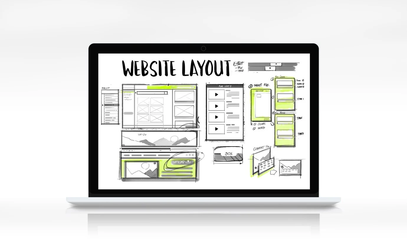
When creating a landing page, there are a few best practices to keep in mind to ensure it is optimized for conversions.
Keep it Simple and Focused
The primary objective of a landing page is to entice visitors and encourage them to take a specific action, such as signing up for a newsletter or making a purchase. In order to achieve this goal, it is crucial to maintain a simplistic and targeted approach to the page’s content. By steering clear of clutter and distractions, you can effectively draw attention to the Call to Action (CTA) button, prompting visitors to engage with your website further. To enhance user experience and ensure a seamless navigation process, opt for a clean and visually attractive design that effortlessly directs visitors towards the CTA button, thereby increasing the likelihood of conversion.
Use a Strong and Clear CTA

When creating your call-to-action (CTA), it is important to ensure that it is easily understood by your audience, straight to the point, and highly convincing. Incorporate words that drive your audience to take immediate action and ensure that it is prominently displayed on your webpage. An effective technique to make your CTA more noticeable is to use a color that starkly contrasts with the rest of the page, drawing the reader’s attention towards it and increasing the likelihood of conversion.
By carefully crafting your CTA, you can influence your audience to make a desired action on your website. Keep your CTA concise yet impactful, using language that motivates the reader to act quickly. Your CTA should be visually striking to ensure it catches the eye of your visitors, making it impossible for them to ignore. Stand out from the competition by using contrasting colors for your CTA button, making it instantly recognizable and increasing the chances of engagement.
To effectively engage your audience and drive conversions, your call-to-action (CTA) must be direct, persuasive, and visually appealing. By using action-oriented language in your CTA, you can compel your audience to take the desired action, whether it’s making a purchase or signing up for a newsletter. To make your CTA stand out on the page, consider using a contrasting color for the button, drawing attention to it and increasing the likelihood of interaction. Ensure that your CTA is clear and easily accessible to maximize its effectiveness and drive conversions on your website.
Include Social Proof
Before we dive into the best B2B eCommerce platforms, let’s first understand why they are essential for your business. In today’s digital age, B2B buyers expect a seamless and convenient online experience, just like B2C consumers. A B2B eCommerce platform can provide exactly that.
Mobile Responsiveness

Today, more and more people are using their mobile devices to access the internet. It is therefore imperative that businesses and website owners prioritize the mobile responsiveness of their landing pages. By ensuring that the layout and design of the landing page is optimised for various screen sizes and devices, businesses can improve the overall user experience. A mobile-friendly landing page not only improves usability, but also increases the likelihood of converting visitors into customers.
Especially with the increasing use of social media, it is great for your business’s digital identity if users coming to your business via social media encounter well-designed mobile websites.
Mobile pages must be fast when opening. If the page opening process of your website is more than 1.2 seconds, the user leaves the page. This seriously affects your conversion rates.
How to Create a WordPress Landing Page
Now that we’ve covered the importance of landing pages and best practices for optimization, let’s dive into the steps for creating a landing page in WordPress.
Step 1: Choose a Landing Page Builder Plugin
WordPress offers several landing page builder plugins that make it easy to create professional-looking landing pages without any coding knowledge. Some popular options include Elementor, Beaver Builder, and Divi Builder.
You can find our blog posts about these plugins. However, the simplest one for you will be to use Elementor. Elementor has both free and paid versions. You can create a good enough landing page even with the free version.
Divi is a paid plugin. If you have a budget and some knowledge, you can use Divi. Both plugins I mentioned are good plugins in terms of performance.
Choose the plugin that best suits your needs and budget and install it on your WordPress site.
Step 2: Create a New Page
In your WordPress dashboard, go to Pages > Add New. This will create a new page where you can build your landing page.
Step 3: Choose a Template
Most landing page builder plugins offer pre-designed templates that you can customise to suit your needs. Choose a template that aligns with your brand and the goal of your landing page.
However, the free version of Elementor does not include templates. You can add templates with some side plugins created for Elementor. You can take a look at our blog posts on how to design a WordPress Landing Page with Elementor.
Step 4: Customize Your Landing Page
Once you have selected a template, you can start customizing your landing page. Use the drag-and-drop editor to add or remove elements, change colors and fonts, and add your own content.
Make sure to keep the design simple and focused, and use the best practices mentioned earlier to optimize your landing page for conversions.
You can compress media files such as images with online file converters or convert them directly to WebP files. WebP is an image file format developed by Google. It compresses your images better without loss of quality.
Another thing you should pay special attention to is not to use larger images than necessary. For example, the width of an image in the text should be around 800px. Thus, the size of the image is reduced and contributes positively to performance.
Step 5: Add Your CTA
When designing your WordPress landing page, it is crucial to prioritize your call-to-action (CTA) above all other elements. The CTA serves as the gateway for visitors to take the next step, whether it be making a purchase, signing up for a newsletter, or downloading a resource. To ensure that your CTA is effectively communicated, consider using a contrasting color for the CTA button to make it stand out against the rest of the page. Additionally, the language used in the CTA should be clear and compelling, clearly communicating the benefit or action that the visitor will take by clicking on it. Ultimately, the success of your landing page hinges on the effectiveness of your CTA, so give it the attention and prominence it deserves.
Step 6: Add Forms and Opt-In Boxes
To capture visitor information and convert them into leads, you’ll need to add a form or opt-in box to your landing page. Most landing page builder plugins offer form and opt-in box elements that you can easily add and customize.
Make sure to only ask for essential information in your form, as asking for too much information can deter visitors from filling it out.
Step 7: Preview and Test Your WordPress Landing Page
Before publishing your landing page, make sure to preview it and test it on different devices to ensure it looks and functions as intended. This will help you catch any errors or issues that need to be fixed before it goes live.
Step 8: Publish Your Landing Page
Once you’re happy with your landing page, it’s time to publish it. Click the “Publish” button in the top right corner of your WordPress editor to make your WordPress landing page live.
Real-World Examples of High-Converting Landing Pages
Airbnb
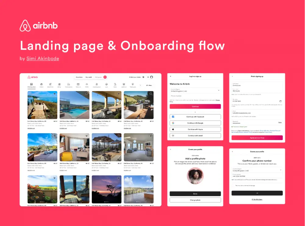
Airbnb’s landing page is a great example of a simple and focused design. The CTA is clear and stands out on the page, and the use of social proof in the form of customer reviews helps build trust with potential customers.
HubSpot
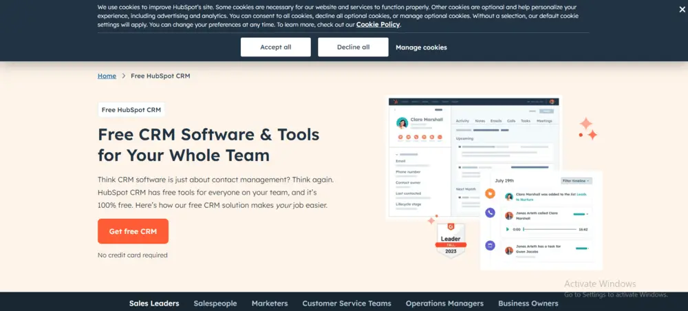
HubSpot’s landing page for their free CRM software is another great example of a high-converting landing page. The design is clean and visually appealing, and the CTA is clear and compelling. The use of a form to capture visitor information is also well done, with only essential fields required.
What is not recommended for a WordPress landing page theme?
- Too many features: While some customization is helpful, a landing page theme with excessive features can be overwhelming and lead to cluttered designs. Focus on clean layouts that prioritize your message and call to action (CTA).
- Menu integration: Landing pages typically aim to remove distractions and guide visitors towards a specific conversion action. A built-in menu on your landing page theme can distract users from your CTA.
- Complex layouts: Landing pages should be clear, concise, and easy to navigate. Avoid overly complex layouts that might confuse visitors or slow down page load times.
- Generic design templates: While some base templates are okay, avoid landing page themes with generic and overused designs. Your landing page should stand out and visually represent your brand or offer.
- Limited responsiveness: In 2024, a mobile-responsive landing page is crucial. Avoid themes that don’t ensure optimal viewing and user experience across all devices (desktop, mobile, tablet).
- Slow loading times: Fast loading speeds are essential for a good user experience and SEO. Choose a landing page theme that is lightweight and optimized for speed.
In essence, a good WordPress landing page theme should be:
- Simple and focused: Prioritize a clean and clear layout that guides users toward your CTA.
- Mobile-friendly: Ensure optimal performance and user experience across all devices.
- Fast loading: Choose a theme that prioritizes speed and avoids unnecessary bloat.
- Customization options: Offer some flexibility to tailor the design to your specific offer and brand.
Conclusion

Creating high-converting landing pages in WordPress is a crucial step in increasing conversions on your website. By following best practices and using a landing page builder plugin, you can easily create professional-looking landing pages that are optimized for conversions.
Remember to keep your landing page simple and focused, use a strong and clear CTA, and include social proof to build trust with your audience. With these tips and techniques, you can create landing pages that drive results for your business.
But before diving into best practices, remember that effective landing pages are tailored to a specific audience and have a clear conversion goal. Whether you want visitors to sign up for a newsletter, download an ebook, or make a purchase, your landing page should be laser-focused on achieving that singular objective.
Is WordPress good for a landing page?
Yes, WordPress can be good for a landing page, but with caveats:
Pros: Easy to use, customizable, SEO-friendly (good for organic traffic).
Cons: Requires plugins for advanced landing page features, might not be ideal for highly conversion-focused pages compared to dedicated landing page builders.
If you need a simple landing page or one with SEO benefits, WordPress is a good option. For highly optimized conversion landing pages, consider dedicated builders.
What is the future of landing pages?
The future of landing pages will likely focus on:
Personalization: Using AI to tailor content and design to individual users for a more relevant experience.
Interactive elements: Incorporating features like quizzes, polls, and chatbots to increase engagement and conversions.
Micro-interactions: Utilizing subtle animations and interactions to guide users and improve user experience.
Focus on mobile-first design: Ensuring optimal landing page performance and user experience across all devices, especially mobile.
Advanced analytics and A/B testing: Leveraging data to continuously optimize landing pages for maximum conversions.
How do I create a dynamic landing page in WordPress?
Here are two ways to create a dynamic landing page in WordPress:
Use a Landing Page Plugin: Popular options like SeedProd, Beaver Builder, or Leadpages offer drag-and-drop interfaces and built-in features for dynamic content like:
Inserting dynamic text (date/time, query parameters)
Personalizing content based on user data or location
Manual approach (for developers): Utilize custom fields, conditional logic, and potentially the WordPress REST API to create dynamic content and layouts based on user data or URL parameters. This method requires more technical expertise.
Are empty pages bad for SEO?
Yes, empty pages can be bad for SEO, but the impact depends on several factors:
Content: A page with absolutely no content (text, images, videos) is generally bad for SEO. Search engines value informative and helpful content for users.
Accessibility: If the empty page is accessible by search engines (indexed), it can waste your "crawl budget." This means search engine crawlers spend time on empty pages instead of finding and indexing your valuable content.
User Experience: Users landing on an empty page will likely have a negative experience and bounce back quickly. This can hurt your website's ranking signals.
How do I create a unique landing page?
Here are some key elements for creating a unique landing page:
Compelling Headline: Grab attention with a clear and concise headline that speaks directly to your target audience's needs.
Strong Value Proposition: Clearly communicate what makes your offer unique and valuable. Why should someone convert on your landing page?
Targeted Content & Visuals: Use content and visuals that resonate with your specific audience and support your value proposition.
Benefit-Driven Copy: Focus on the benefits your offer provides to the user, not just features.
Clear Call to Action (CTA): Tell visitors exactly what you want them to do, whether it's subscribing, downloading, or purchasing.
Standout Design: While following landing page best practices, incorporate unique design elements to make your page visually memorable.
Limited Distractions: Avoid unnecessary navigation links or clutter. Keep the focus on your offer and the CTA.


